While ProM does not contain editors, it does contain many graphical visualizations. A non-trivial subset of these are canvas-like in nature, a very prominent example being graph-like visualizations. One of the graph-like visualizations is the Petri net visualizer. Canvas-like visualizations share the property that they are scalable – a fact that is often needed to visualize large amounts of data.
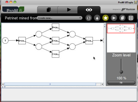
In the (very recently) released ProM 6, the Petri net visualization looks like this:
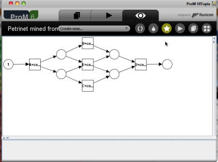
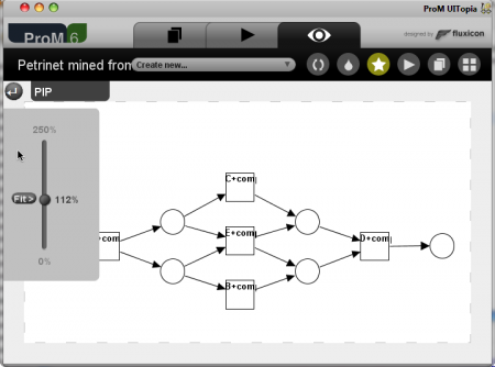
The main area to the left contains the Petri net and to the right is a panel containing an overview of the model (in case it has been magnified or for some other reason does not fit in the window) and a zoom-slider. At the bottom is a panel which doesn’t seem to be used for anything. If a user feels that the zoom-facility takes up too much space, it can be collapsed, leaving you with this:
More space but less accessible zooming. This approach does also not scale very well, if we wish to allow more controls (controlling, e.g., automatic layout) or want to display information about parts of the model (e.g., timing information for transitions), we have to add more panels, which needs to be collapsed and restored all the time. The fact that the ugly divider-thingamajig blends in poorly with the rest of the user-interface does not help matters either.
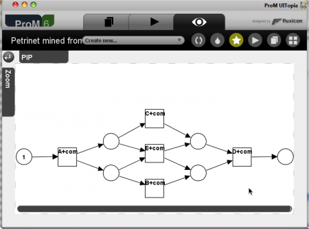
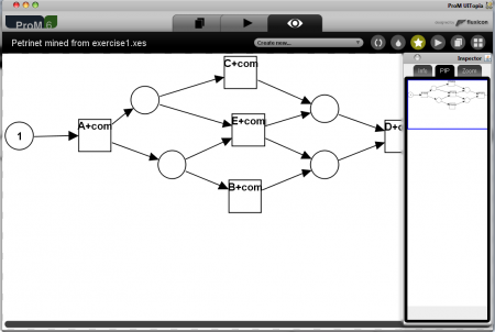
In ProM 6 the overview picture is quite specific to the graph-based canvas and not too efficient, so some of the guys decided to create a generic scalable canvas, based on the visualization of Petri nets generated from a more specific view. The idea was that instead of having panels that needs to be opened and closed manually, to instead show tabs and have them expand and collapse automatically. The updated Petri net visualizer looks like this in the collapsed form:
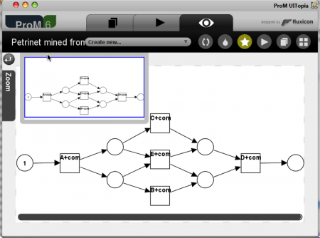
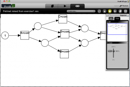
The panel has been removed and instead we have two tabs: one for the overview (Picture-in-Picture) and one for the zoom-slider. The scroll-bar has been replaced by one that blends in better, and everything looks much nicer. When you hover over one of the tabs, they automatically expand to show their contents:
The tabs do not take up much space when collapsed, and the approach is better scalable as we can just add more tabs when needed. To show auxiliary information we can add tabs containing overview information (such as the fitness value of a particular mined model) either when expanded or directly in the tab name. This approach suffers from three things in my opinion, one serious, one medium important and one less important and easily fixable. The easily fixable one is that I do not like the aesthetics of this layout. I’d have the tabs grow into the page, smaller tabs and smaller font in the tabs. This is of course debatable and easily fixable. More important is the fact that the tabs still use quite a lot of space around the model: 30 pixels at each border. For the simple visualization here, two sides are completely wasted. The most severe problem with this solution is that the tabs are damn difficult to hit. They are relatively small targets (the zoom one is ok if the window is maximized as it will then be infinitely wide because it’s at the edge of the screen, the PIP is impossible to hit no matter how you arrange your windows) and you need to be careful not moving outside the border of the widget when using it, as it just disappears. This problem can only be fixed by making the targets (and borders) larger, consuming even more space. Furthermore, the tabs are static and can only be repositioned by the programmer, so most likely the panel you want to use will cover the element you want to inspect.
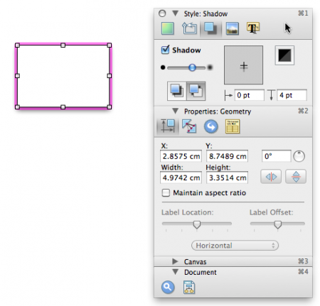
So, we prefer something with larger targets, something not using too much space, and something that gets out of the way when you don’t need it. I took a cue from Apple, who has moved away form things that disappear automatically, and instead almost all applications on the Mac has an inspector, a window which allows you to see properties of stuff. The inspector is a separate window that is always at the top of the window you are working with. The inspector requires very little interaction, as it cannot be resized and always positions itself in a sensible place. As an example of an inspector, here is a screen shot from OmniGraffle:
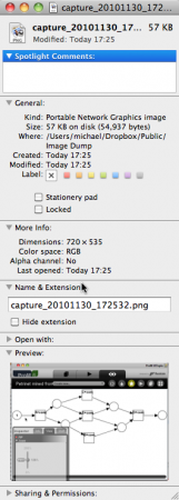
The inspector contains several groups that can be collapsed or expanded (Style, Properties, Canvas, and Document). The inspector can thus take up as much or as little space as needed. Here is another example from the Mac Finder:
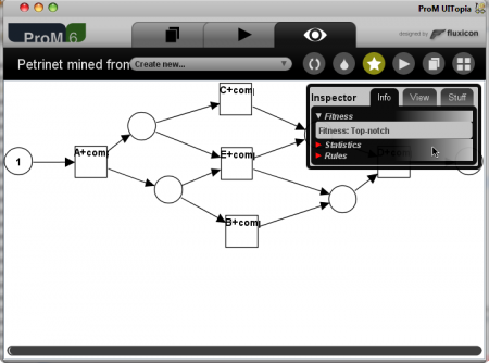
Wee see the same structure: single window, not resizable, groups that can be expanded, and room for both auxiliary information as well as for simple settings. I made a similar inspector for ProM:
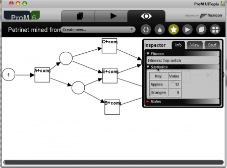
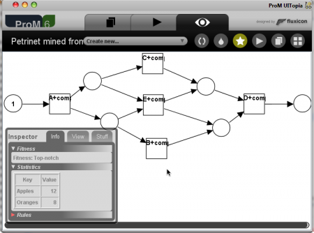
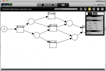
It contains tabs for major groupings (one for showing information, one for controlling the view, and custom views can add others). Each tabbed region contains one or more groups, here we see three (fitness, statistics, and rules), one of which is expanded (fitness). The inspector takes up quite little space in the default configuration. We can expand groups by clicking on them:
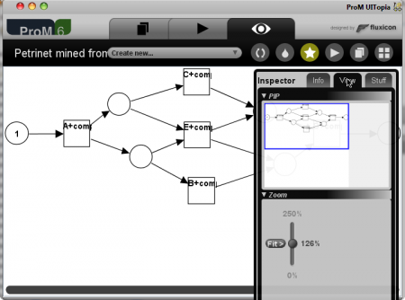
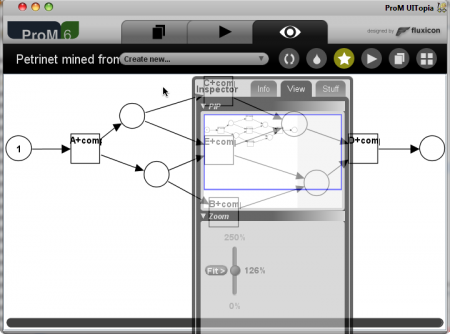
(who says, you can’t compare apples and oranges? ;-)) Groups can contain any JComponent, for instance the overview and zoom-slider from before (they have not been fitted to match the inspector, which is why they look a bit off):
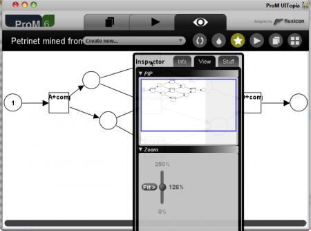
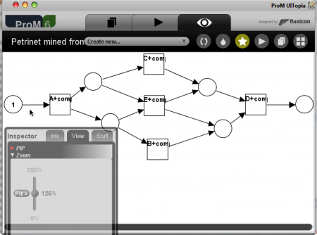
We note that at each point, the inspector automatically scales to accommodate the information needed. Only when information is no longer needed, does it shrink, so we can allow smaller borders, and the entire inspector is a target. Here the inspector covers part of the model. To alleviate that, we can move it around (not really solving the problem in this case for pedagogical reasons):
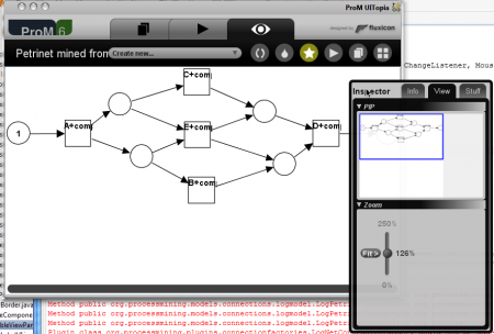
The inspector is not tied to the window, and can be moved outside the main ProM window:
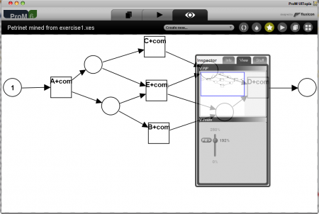
When the inspector is not used, it fades out and lets you see thru it:
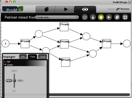
Even in this horrible case (heaps of contrast in the inspector) it is possible to get a vague idea of what is happening in the background, but naturally this works better if the inspector view does not have as much contrast. A more realistic, and also more convincing example is if we close the overview and move the zoom-slider to the lower-left:
This gives a non-intrusive widget for scaling the model. This is also useful for showing auxiliary information:
So, this is my proposal. I think is is superior to both previous attempts: it is more scalable (can add many groups due to hiding and can add completely new tabs) and easier to use (nothing hides without a user explicitly asking for it and it is always obvious which (kind of) information is available) plus it blends in better with the user-interface. Here, the inspector looks gigantic, but in normal use it would only be around half the size compared to the canvas, as the window would be larger (I have used a very small screen-size of 720 * 535 as the surroundings of the inspector are not the interesting parts). The inspector also gets quite a bit smaller if we don’t add the Stuff tab.
I am still not entirely sure if I like the transparency – but it is very easy to go to the non-transparent version, as the target is rather large, namely the entire inspector. I have also considered making it possible to close the inspector, essentially making it dock on the window like the first version I showed (but less ugly ;-)), as well as making the inspector turn form vertical to horizontal when it is moved to the bottom of the screen.
As a bonus, have some screen shots of earlier iterations. They also give a better impression of the size as these screen shots are taken with the standard window size of ProM. First version using standard window decorations:
Second version with grouping:
Third version with nicer window decorations:
Fourth version with transparency and a window title:
The fifth version, shown above, additionally adds nicer expander triangles and the ability to change the transparency.


Hi Michael,
Nice one. I also found the tabs difficult to hit. While I did not try your solution yet, it seems the best one so far.
You seem to have an issue with left and right though 😉
Hi Anne,
Thanks for the comment. It seems we will be discussing this and the tab-solution next Monday on the ProM developers meeting.
And what do you mean I mess up left/
downright? 😉 (Thanks, I’ve fixed it — I hope.)Yeah, I think it’s fixed. It’s just that the first one confused me, and when I saw the second one I thought it might be a pattern 🙂
Good initiative anyway.