I often do analysis of logs. I have used many different tools, from a simple ad-hoc command-line analysis using sed and grep, over a more detailed analysis using Excel, and all the way to setting up dedicated reporting tools like Jasper Reports or Grafana.
Sometimes, I just need to quickly inspect a simple log, but I actually need a lot of the functionality from the more heavy-duty tools (like especially Grafana), but without all the hassle, and without the need to be able to run the same reports again later. Enter Tableau…
Tableau allows me similar dashboard functionality as Grafana, but is simpler to use for ad-hoc analysis. Furthermore, Tableau works with simpler data sources. Grafana requires I have my data in some sort of database (preferably a time series-like database like Prometheus on Influx but that part is negotiable), but while Tableau also can analyze such data, it also supports simpler data sources like Excel files or just plain CSV files.
Yesterday, I received a CSV file with some data. We have an application that uses SOAP over JMS and in the past, it had issues with leaking TIBCO EMS producers because the application was also pooling dynamically allocated response queues. I swear that last sentence makes sense, but the technical details don’t really matter here: we are looking for why we are leaking a particular kind of resources. I got a list of all the producers in the TIBCO instance and imported them into Tableau:
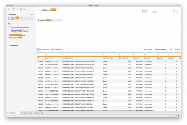
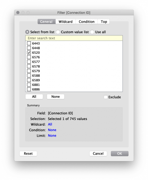
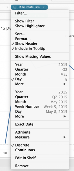
We see it has recognized the data and formatted it meaningfully; I change the type of the Create Time column to “date and time” and apply a filter because I know that the connection ID I am interested in is 6520:
Since we’re performing a leak of producers, I am interested in knowing how many we accumulate per day. I create a simple chart:
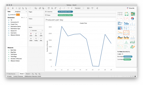
I have just dragged the creation time from the left to the columns and the number of records to the rows and selected a chart type. I have also told Tableau to group the timestamp by day:
Seems we’re leaking ~2500 producers/weekday.
I double check that this is indeed the source of the leak; I create another chart of all non-response producers:
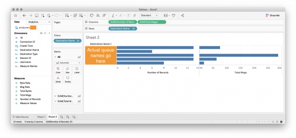
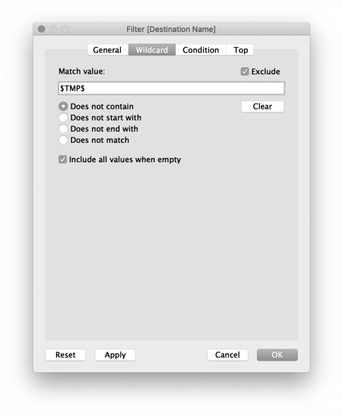
I’ve dragged out the destination name, number of records and total messages, and selected a bar chart. I have also added a filter on the data by dragging the destination name to the filter box and filtering out all dynamic destinations:
From the bar chart, we easily see that we have a very controlled number of permanent producers for a very controlled number of destinations.
When I fixed a previous more grave connection leak, I split out connection pool into two: one for connections from our application and one for connections to our application. I disabled producer pooling on incoming requests (as requests would go to dynamically created queues and pooling producers for this would not make sense).
The data above suggests that I am looking at the connection pool for outgoing requests, which does pool producers; the 5 queues with 6-13 producers each correspond to the 5 services we call and makes sense to pool them (we have sent 28.6k messages on the just 13 producers in the middle).
Thus, it seems I have accidentally put one of the incoming services in the outgoing services connection pool. Comparing with production statistics in Grafana, I find the culprit:
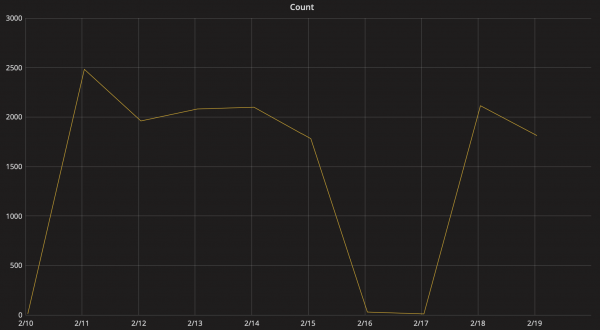
We see this data has a very similar shape and magnitude as the Producers per day chart above. There are a few fewer requests than there are in the above chart, so there’s like also another smaller culprit I need to account for.
Altogether, this shows a simple data analysis using Tableau. It’s pretty good at it.